
Tradition
Mäkleri
This is a story about a small realtor named Tradition who had watched their industry turn for the worse with quick wins, dirty tricks and little concern for the people for whom life is about to change.
They wanted to raise the bar and decided to become a stronger voice. They needed to scale up and show up so they called their friends at TBD - wohoo that’s us! Together we made the brand work they needed to get out there and make a change.
We started at the core, with a brand platform with values to unite their new and larger crew. Then of course a visual identity complete with new signage and all the paper products and other bits and pieces needed for everyday work, a website design and concepts for communication to make them visible and recognised in the marketplace.
Right from the start, it was clear that Tradition’s perhaps biggest differentiator in the marketplace was their respect and consideration for the people involved in the process of buying and selling a home.
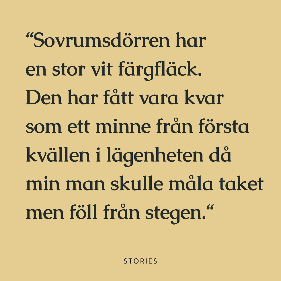
One of the first meetings we had with them, they explained why they liked the name Tradition to begin with. The name Tradition means to turn something over from one hand to another. To pass something on. To give someone else what you have cared for, so that they in turn will take care of and enjoy it’s benefits. To them, being a realtor was not about the profit, the big money or the exclusive spaces. Of course, the business side of it is a big part of the responsibility as buying and selling a home is the biggest investment most of us make in our life. But it’s about more than money. It’s about memories, saying goodbye and hello to an era of your life and leaving your safe place in life.
Telling the stories of those homes, and of Tradition as a realtor who respect them, was going to be important. You will see that this carries through the work like a red thread.
“
“The name Tradition means to turn something over from one hand to another. To pass something on. To give someone else what you have cared for, so that they in turn will take care of and enjoy it’s benefits“
“It’s about more than money. It’s about memories, saying goodbye and hello to an era of your life and leaving your safe place in life“


This is what we did for tradition.

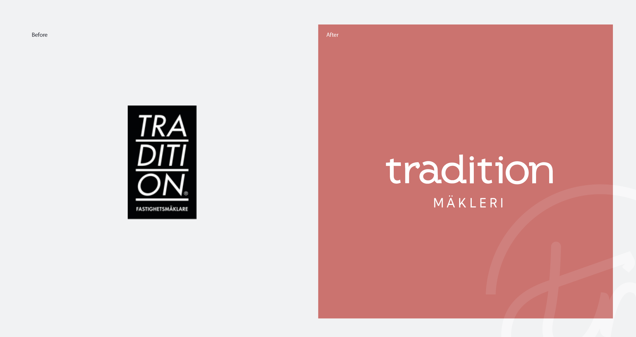
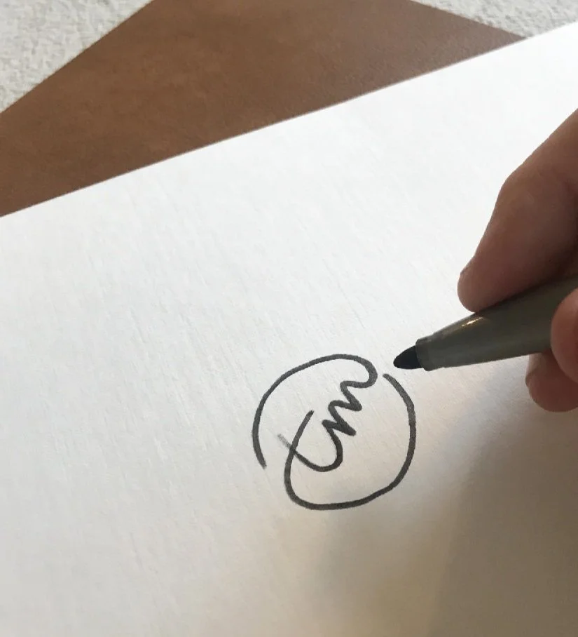
Word mark & Stamp
Modern to indicate something new. Crafted to not be too stiff. Classic and elegant at the core, with just enough quirk not to be boring. A handcrafted emblem to use as a mark for the quality realtors it represents.
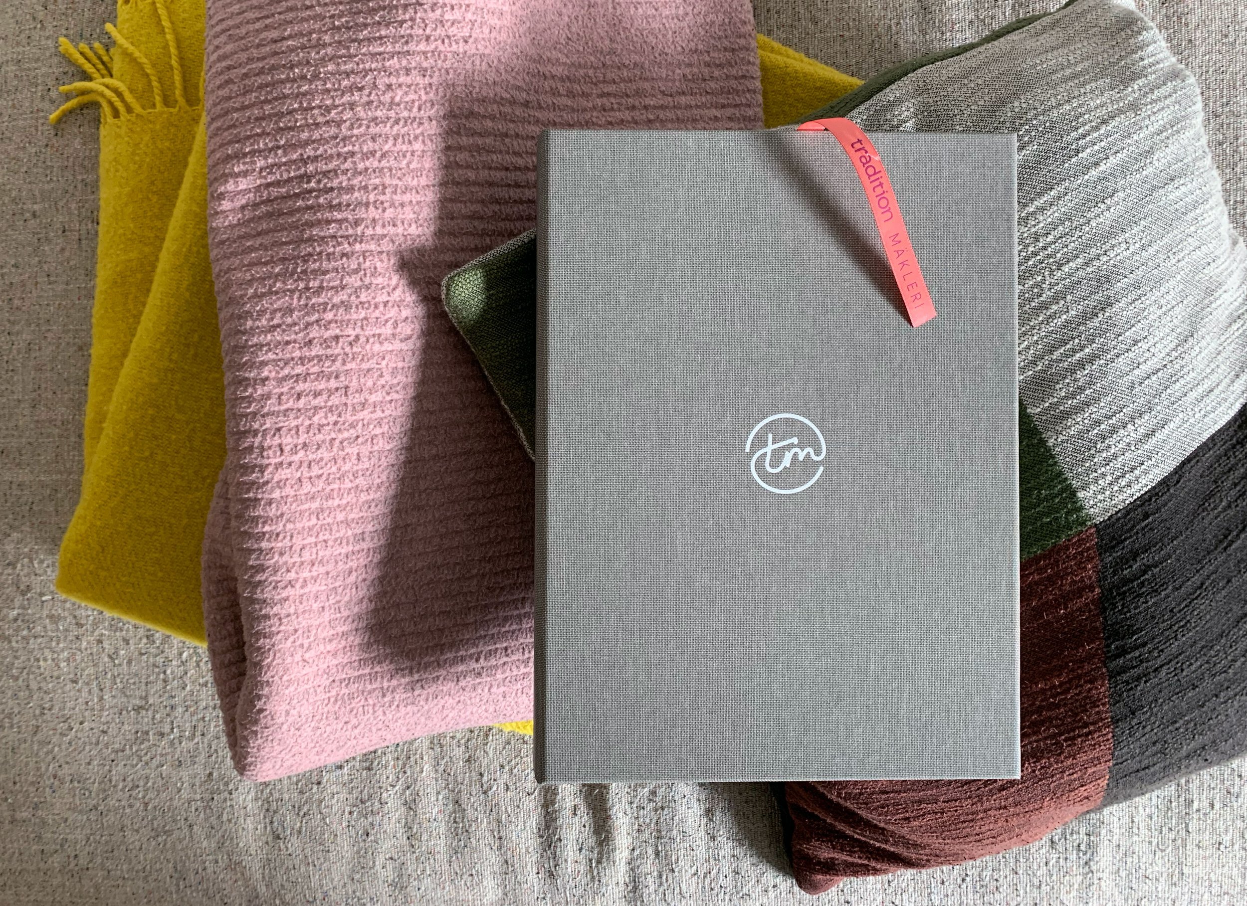
Color palette
Luxuriously generous and vibrant, the color palette allows for us to bring just the right mood to every home we sell. The colors we have chosen each represent something that might feel like home. Red wine, Raspberry pie, Midnight sky, Forest green, Frost, Chalk, Chanterelles, Ink och Ice pops. Together they strike the perfect balance between somber and bright to create contrast, variety and nuance.
Imagery style
With our imagery we like to find and show the real people and the non-moments that make our life at home so satisfyingly relaxed and so liberatingly energetic.
Besides the photographic style, images of the homes for sale are shown within frames to emphasise the memories and life that has been lived within those walls. We know it’s generally considered a no-no to hint to the fact that people live in a home for sale, but for Tradition it was the story that needed to be told.
Voice & Values
Tradition needed a voice to carry both the steadiness and integrity that a great realtor needs, but also the warmth and the human touch that is so characteristic to Tradition. We helped shape brand pillars, a voice and key messages that make us see just how different they are in their space.
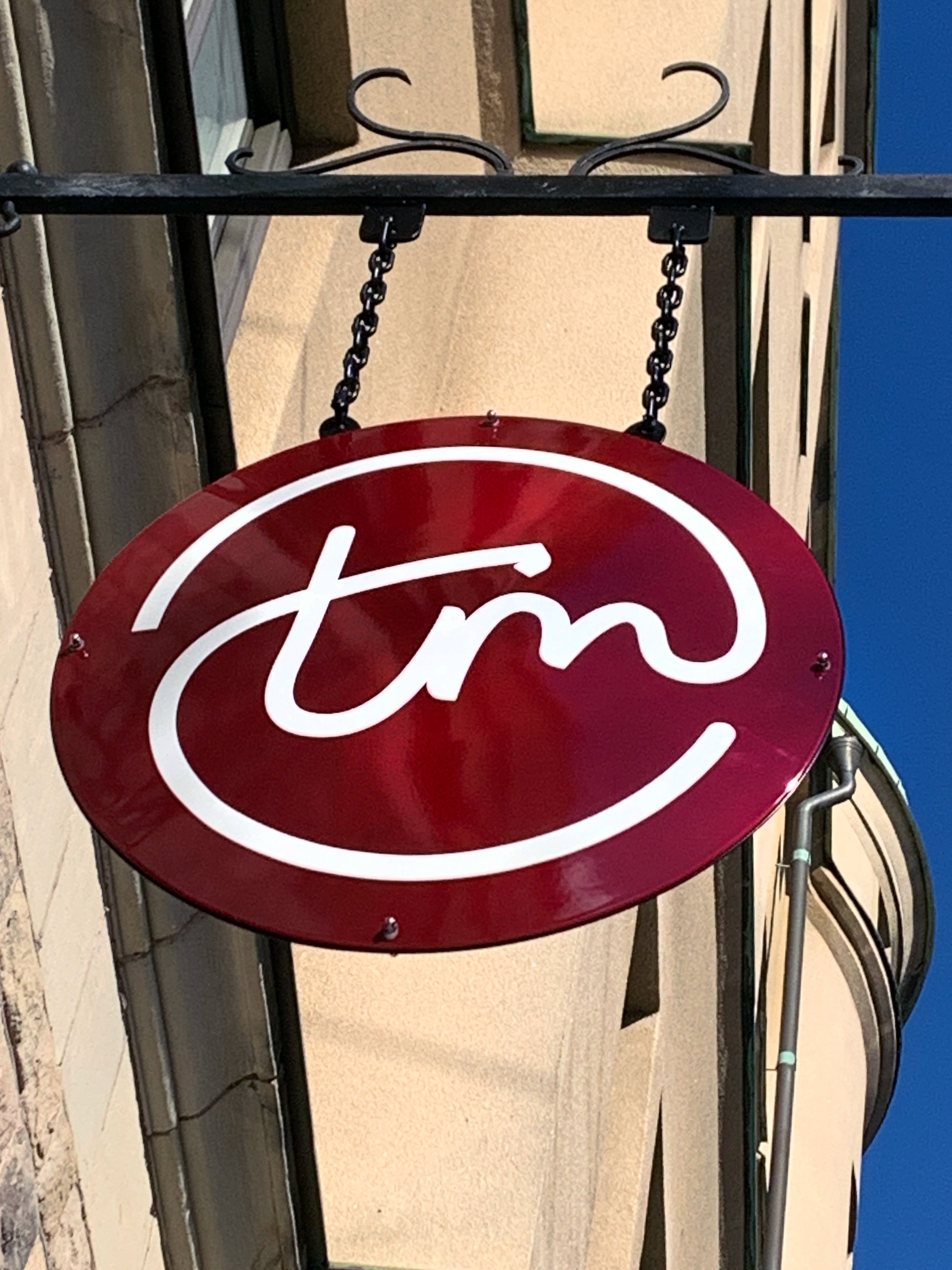
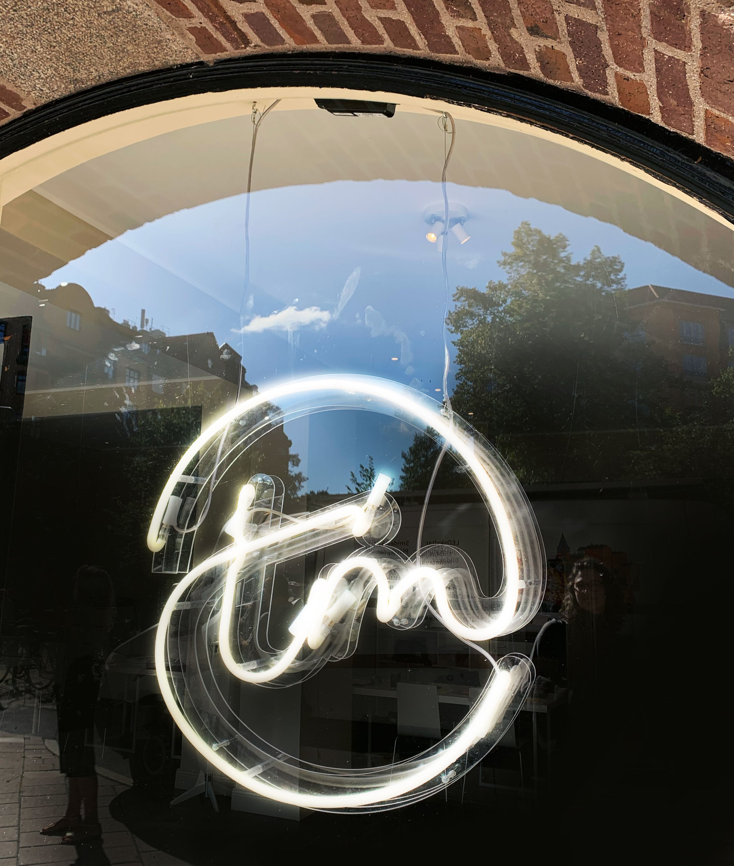
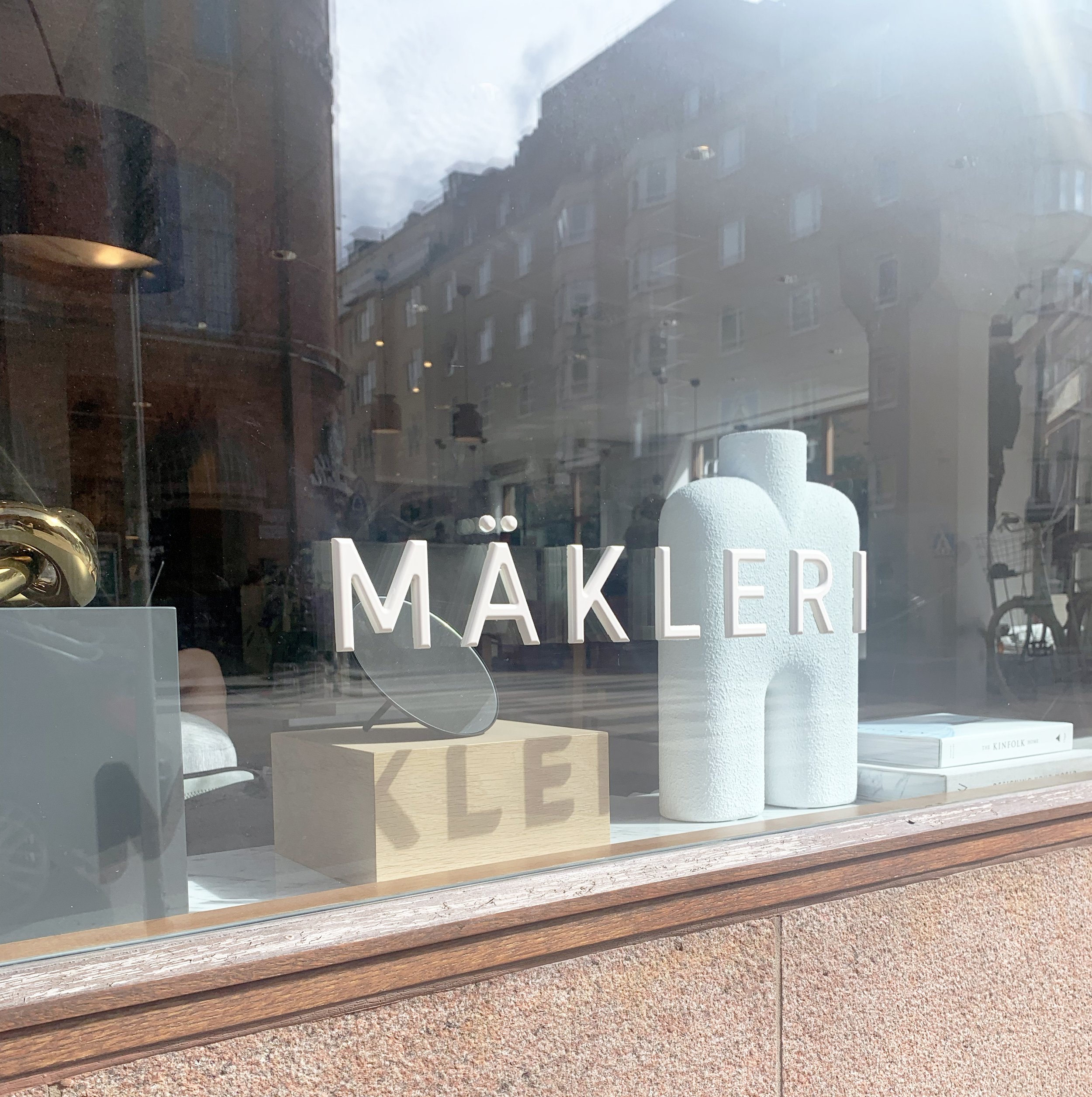
Signage
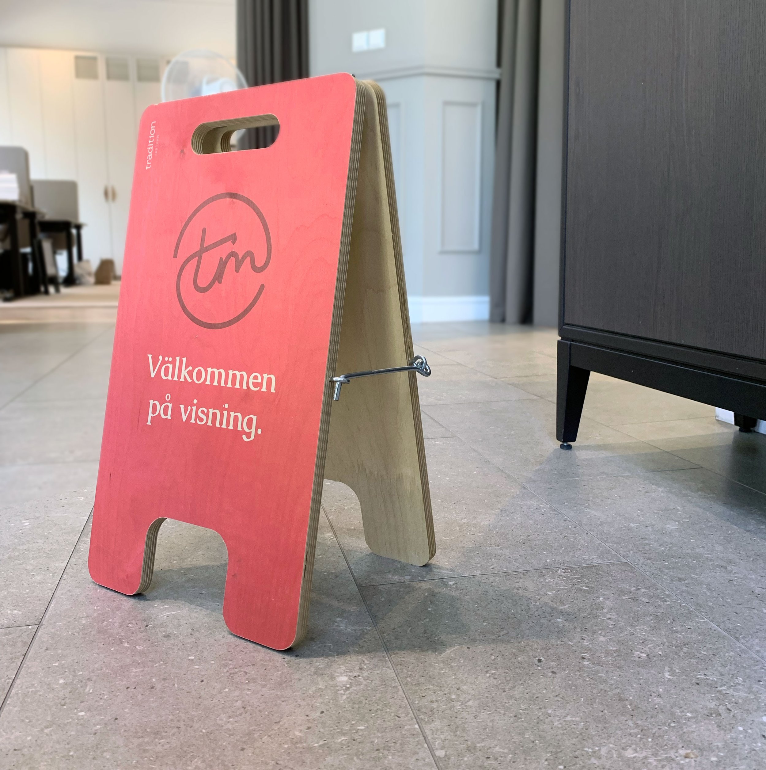
To tie three completely different shops into one and to be able to scale at large over time - We made a simple signage system based on three units. Window units with tactile 3D-lettering. LED signage (two sizes) for outside and inside use. Plus a coherent TM- Neon sign to pivot in all of the shops windows. For real estate agents it’s also important to have a flexible and visible portable street sign. We made it uniquely great out of wood.
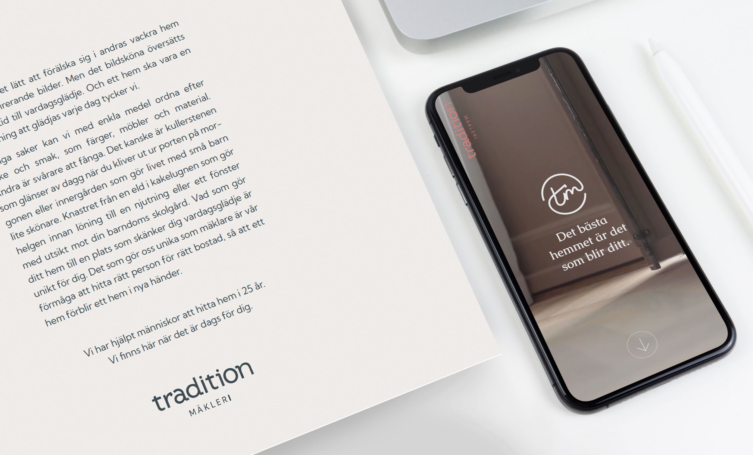
Digitals
Digital sales materials, signage systems and website to make all of the personality, hard work and attention to detail shine through at all times. We made a quick modern explorative web and tried to break the unwritten rules of real estate-sites ie. only big couch mode-images, and more about the memories and framed imagery and words.
Prints
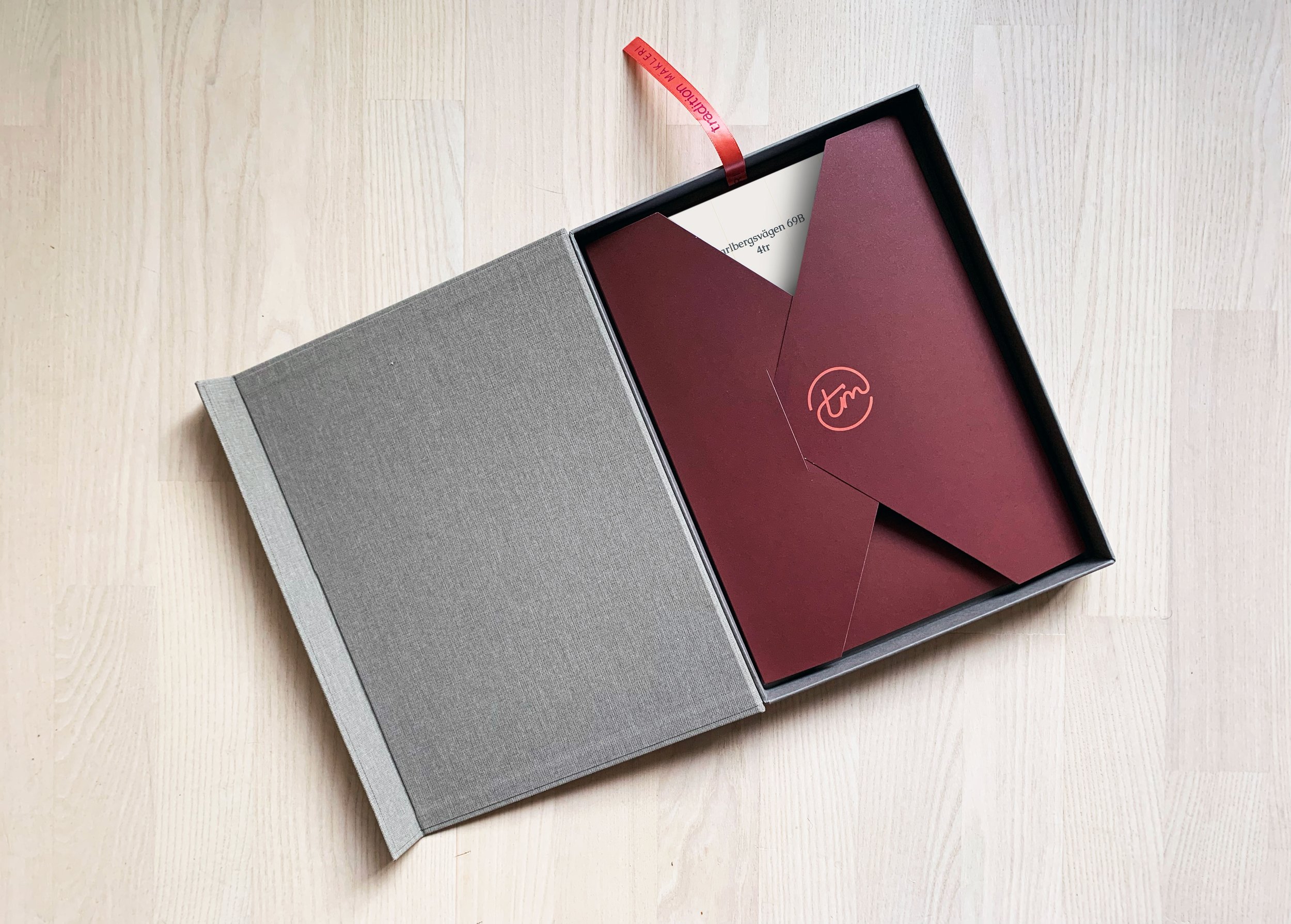
A modern real estate agent uses mostly web and QR-codes to digital sales material, so do Tradition. Yet they wanted to make a mark, to leave something that lasts, like a memory. We made a box, girdles, holders, wrappers and printed materials.
Communications
To get going with their powered up business, Tradition also needed hands-on examples and concepts for how to communicate and get seen and heard in the market place. We wrote key brand statements and made the brand launch banners and posts, along with a concept and banners and social posts for their first brand campaign.
